
By Daniel Ebi, Minna
The Niger State Pilgrims’ Welfare Board has organized a one-day pre-Hajj workshop for its operational staff as part of preparations for the 2026 Hajj exercise.
The workshop was designed to enhance participants’ understanding of evolving guidelines and operational procedures for the upcoming pilgrimage.

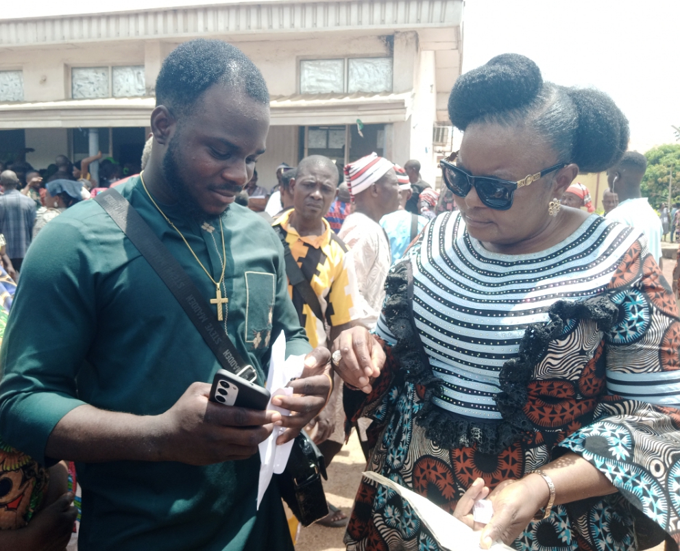
The event, held at the Women Multipurpose Hall, Old Secretariat, Minna, brought together key stakeholders, including security personnel, Ulama’a, Board members, and Area Pilgrims Welfare Officers (APWOs), who play critical roles in guiding pilgrims throughout the Hajj process.
Speaking, the Executive Secretary of the Board, Sheikh Muhammad Awwal Aliyu, stated that the workshop is an annual initiative aimed at equipping operational personnel with up-to-date knowledge and insights on emerging developments in Hajj operations.
Represented by the Director of Administration, Malam Ado Bello, the Executive Secretary expressed appreciation to all stakeholders for their attendance and encouraged participants to engage actively for a successful outcome.
Responding, the Amirul Hajj for 2026 and Emir of Agaie, Alhaji Yusuf Nuhu, urged participants to pay close attention to the proceedings and maximize the opportunity provided by the workshop, describing it as essential to the success of the Hajj exercise.
Also speaking, the Chairman of the Niger State House of Assembly Committee on Religious Affairs, Isah Muhammad Etsugaie, represented by the Committee Clerk,
Abdullahi Shuaibu, emphasized the vital role of Islamic scholars in ensuring the smooth and successful conduct of the Hajj pilgrimage to the Kingdom of Saudi Arabia.
The workshop covered both spiritual and operational components of the pilgrimage, including sessions on Manasik (Hajj rites), visitation procedures in Madina, and strategies for effective coordination.
Participants also received presentations from key agencies such as the Nigeria Customs Service, Nigeria Immigration Service, and the National Drug Law Enforcement Agency (NDLEA), highlighting the importance of inter-agency collaboration and compliance with regulatory requirements.


An interactive session provided an opportunity for participants to ask questions, share experiences, and address operational challenges, thereby fostering teamwork and improving overall preparedness.
The Board reaffirmed that the workshop is part of its broader commitment to ensuring that all intending pilgrims from Niger State are properly guided, adequately supported, and able to undertake the Hajj with confidence and ease.
Hola a todos, estoy organizando un viaje a Tenerife y tengo ganas de hacer jetski durante mi estancia. He estado leyendo sobre los dos lugares mas recomendados para esta actividad: Los Gigantes y Playa de las Americas. Por lo que he visto, Los Gigantes tiene unos acantilados imponentes que creo que crearian un marco visual magnifico mientras estas sobre el agua, pero he leido que puede ser un poco mas complicado para alguien con nivel intermedio, especialmente con el oleaje y las corrientes que no son faciles de manejar. Por otro lado, Playa de las Americas parece bastante mas sencilla para empezar, ideal para pasarlo bien sin complicaciones, aunque las vistas no son tan impresionantes. Para alguien que desea un equilibrio entre el paisaje y el disfrute sin riesgos, ?cual recomendarian? He encontrado un post con fotos y informacion que ayuda a decidir entre ambos sitios me encantaria escuchar experiencias reales de quienes hayan probado jetski en ambos sitios. ?Cual creen que tiene mayor encanto para alguien como yo que busca una experiencia equilibrada con buenas vistas? Muchas gracias por sus recomendaciones.
I am editing a remote podcast interview for a local history group. The conversation is clear and worth keeping, but a few transitions contain tiny digital ticks and a light shimmer around some consonants. Because the guest speaks quietly, I do not want aggressive processing to make the voice sound flat or distant. I have been reading about different ways to inspect a recording and came across . I am not looking for a one-click promise; I need a sensible review process before I touch the final edit. Would you begin with visual inspection, careful listening, or short comparison exports? The speaker’s voice needs to stay recognizable. Each small repair should be easy to undo. I can work on several troublesome moments at a time. The dialogue must remain comfortable. I would prefer gentle adjustments over broad filtering. A separate comparison export would help with judgment. I also need clear notes for the producer. The room tone should remain consistent. The final episode must still sound direct. Each decision should remain simple to explain. I can review it at normal volume. I can accept a trace of noise if the words remain easy to follow. What has worked well when a spoken recording needs careful repair? I would value examples from editors.
Over a few listening sessions I have been trying to understand a high, repeating texture in one generated track. It may be part of the arrangement, but it also sounds slightly mechanical when the mix gets quiet. I first noticed it on headphones, then checked the same section through small speakers and heard a softer version there too. That made me curious rather than certain. For a fair comparison, I disable extra limiting before listening again. At the end of each check, I record a short description before changing anything. I opened a spectrogram and saw a narrow bright trace near the moments that bothered me, although I know a picture alone cannot tell me whether the sound is a fault. fixsuno.top seemed useful as a neutral comparison point while I worked out what to listen for next. I am trying to avoid treating every unusual detail as damage, because some of the best parts of generated music are unexpected. My next step is to compare a fresh export, then make notes on the exact timestamps before considering any repair. For those who use both ears and visual tools, what convinces you that a strange high-frequency detail is an actual artifact? Is there a basic check that helps separate curiosity from over-editing?
Recently I have been trying to understand a high, repeating texture in one generated track. It may be part of the arrangement, but it also sounds slightly mechanical when the mix gets quiet. I first noticed it on headphones, then checked the same section through small speakers and heard a softer version there too. That made me curious rather than certain. Rather than guess, I remove extra limiting during the test. Before editing further, I record the exact moment without judging it. I opened a spectrogram and saw a narrow bright trace near the moments that bothered me, although I know a picture alone cannot tell me whether the sound is a fault. seemed useful as a basic diagnostic note while I worked out what to listen for next. I am trying to avoid treating every unusual detail as damage, because some of the best parts of generated music are unexpected. My next step is to compare a fresh export, then make notes on the exact timestamps before considering any repair. For those who use both ears and visual tools, what convinces you that a strange high-frequency detail is more than a texture? Is there a basic check that helps separate curiosity from over-editing?
A family wardrobe clear-out has become a weekend vintage-selling project. Last week I described a cardigan as warm burgundy, then noticed it looked plum on another screen. It was a small discrepancy, but accurate descriptions matter for second-hand items. A studio setup is unrealistic for the small number of items I list. I currently use indirect window light, a grey card, and one fixed phone profile. That setup improves exposure consistency, and I still struggle to describe whether a shade leans warm, cool, or neutral. I used this deep autumn color palette page to build a small vocabulary list. Season names are useful references, but I avoid presenting them as objective guarantees. The revised listings will separate the visible base color from any tentative undertone wording. I will also keep the grey card visible in one unedited reference photograph. This seems more honest than forcing every garment into an exact palette category. Does anyone use a similarly modest workflow for photographing second-hand clothing? I am interested in phrases that remain accurate across ordinary phone and laptop screens.
I received a possible soft cool result and would like to check it in everyday life. Rather than buying new clothes, I pulled together scarves, shirts, and jewellery I already own. The easiest comparisons happen when the rest of the outfit stays neutral. The likely keepers are soft blues and roses, but I need more observations. I write down visible effects before deciding if a colour belongs in the palette. A brief what is my color palette can be useful as a prompt, but I still want real garments to guide the decision. I do not want to turn one tentative result into a strict list of forbidden colours. A repeated comparison helps me avoid reacting to one unusually good lighting moment. Which small wardrobe experiment gave you the clearest information? Practical examples with familiar basics would be more useful than a shopping list. A slow test feels wiser to me than replacing everything at once. I hope to learn from repeated outfits rather than from a single impressive image. I would appreciate any grounded tips from people who tested this gradually.
I am helping with a small wedding that will use cool evening tones. The people standing with her include a range of skin tones and personal wardrobes. The goal is not to make every person wear the same cool pastel. Instead, we are considering a family of smoky blue, muted berry, soft charcoal, and silver accents. To give the discussion some structure, I looked at to understand which accents might work together in photographs. It seems easier if we choose related fabrics that still give each person some choice. I want to see the proposed colors near each other in natural afternoon light. Did anyone here manage different personal palettes around one event color family? We are also keeping the venue and season in view, because a color that looks elegant on a digital board can change once it meets warm wood, candlelight, and autumn flowers. The aim is a relaxed group photograph, not a technical demonstration of a palette. Comfort matters too, since everyone will be wearing these choices for a long day.
I am revisiting my seasonal analysis because olive skin seems to confuse many quizzes. My hair is very dark and my eyes are medium brown, so the overall contrast can look winter-like. Yet in some lighting my skin has a green-gold cast that automated tools often interpret as warm. Clear orange looks harsh on me while cool berry and deep teal are usually easier to wear. This repeated contrast leaves me unsure whether I belong in a cool winter range or a softer neighboring season. olive skin tone seasonal palette offers a useful framework but I do not want to force the result to match one chart. For a simple home comparison would you compare pure white with cream before testing accent colors? Both common metals seem acceptable so I need clues that work better for olive skin. I can photograph the same drapes and review whether shadows, redness, or eye definition change. Which winter colors would you test first without relying on stereotypes about skin depth? Observations from olive-toned members would be especially useful. I care more about repeatable tests than matching every traditional description perfectly. Thanks for helping me compare these clues
We are organizing a modest ceremony with a calm cool-toned theme. The bridal party includes friends who do not all feel good in the same shades. We do not want to force everyone into one identical icy dress color. Our current idea is coordinated cool tones rather than a single prescribed shade. While comparing options, I found notes on soft winter color palette because it suggests cool contrasts without requiring one exact outfit. We could then choose related fabrics that still give each person some choice. Before deciding, we plan to test sample fabrics with the flowers before anyone buys an outfit. If you have organized a similar event, what helped you balance a varied group with related colors without making it look overly uniform? We are also keeping the venue and season in view, because a color that looks elegant on a digital board can change once it meets warm wood, candlelight, and autumn flowers. The aim is a relaxed group photograph, not a technical demonstration of a palette. Comfort matters too, since everyone will be wearing these choices for a long day.
I received a possible soft cool result and would like to check it in everyday life. Rather than buying new clothes, I pulled together scarves, shirts, and jewellery I already own. I compare one colour at a time against a plain neckline in morning daylight. Soft navy, smoky rose, and muted teal feel promising, while icy pastels feel less certain. I am trying to separate a pleasant colour from one that actually looks harmonious. A gentle what is my color palette might suggest questions to test again with fabrics I already understand. A possible season should not make everyday choices feel unnecessarily rigid. I try each candidate shade more than once before I call it a reliable favourite. How did you check a tentative palette before spending money on new colours? I would love suggestions that work across casual clothes and simple makeup. I would rather build confidence through repetition than make a fast declaration. I will keep the useful notes even if the first seasonal result changes later. Thanks for sharing what made your palette experiments more realistic.
I have been attempting a simple undertone check with my phone, but the result changes every time I move rooms. Different bathroom mirrors seem to change the apparent balance of my skin much more than I expected. I would like to take several photos near the same window on separate days. I will keep makeup, filters, and automatic colour effects out of the process. Instead of using one quick snapshot I would compare a few neutral fabrics beside my face. Soft white, muted blue, berry, and charcoal would give me more than one clue to consider. It may help to write down whether each shade makes shadows, redness, or unevenness more noticeable. I want to look at the images together later, not one at a time. I am using this guide only as a starting point: Do you have a low-effort routine that reduces misleading camera colour?
I am planning a small work wardrobe and would rather choose a few useful colours than chase every shade in a seasonal palette. The smallest starting point is to begin with two neutrals, one darker accent, and one lighter colour near the face. I keep returning to navy, charcoal, muted blue, berry, and a soft off-white. Before I commit to the colours I want to see each option next to fabrics that I already wear often. Existing shirts and scarves should make the contrast easier to judge than isolated digital swatches. I am trying to avoid a rigid category but I would like a sensible direction for future purchases. I plan to test the small range repeatedly before expanding it with new purchases. I am using this to organise the possibilities: That should leave me with a flexible, smaller range to try. Which four or five colours would you test first for a practical, low-volume wardrobe?
I am planning a capsule wardrobe and want to confirm my season before choosing the main colors. Most quick quizzes place me in autumn although the exact subtype changes. Camel and olive work well but mustard and strong rust can make my complexion look uneven. Because the plan uses only a few pieces each neutral and accent needs to combine easily with the others. helps me group the likely shades but I would like to validate the direction with actual fabric. My first idea is to compare cream, warm navy, chocolate, olive, muted teal, and brick. I would photograph each color in indirect daylight using the same camera settings. For the neutrals should I focus more on skin clarity or on harmony with my hair and eyes? I would like two flexible accent colors that can work across casual and slightly formal outfits. Muted teal seems promising while brick red may be easier than orange. Is this a sensible autumn test or should I add a cooler control color for comparison? A simple order for the drapes would help me avoid buying colors based only on a label. I care most about easy combinations rather than following every suggested autumn shade. Thanks for any practical advice
I am replacing my glasses and keep getting different advice about which frames suit my face. One friend calls it oval, but I suspect the camera angle and the frame width are affecting those impressions. Before ordering anything, I want a more consistent way to look at the outline of my face. I have tried looking at my forehead, cheeks and jaw together, yet even small changes in lighting seem to change what I notice. For another reference I came across while thinking about how glasses work with the rest of my appearance. That made me realize that color and shape are separate questions. To focus on proportions, I am considering a face shape check before comparing frames in person. Would you use a straight-on photo with hair pulled back, or is there a better way to avoid a misleading first impression? I would like to hear if people found that their apparent face shape changed when they switched lenses or stepped farther from the camera. I would like to understand the proportions first before buying a pair based on a label that might be wrong. What has worked for you?
I’m reducing my wardrobe and would like a small group of colors that works with the clothes I already wear. Right now I have several nearly identical tops in different shades. I don’t need a perfect seasonal label, but I would like to understand why some combinations look calmer than others. I may start with two easy neutrals and a single brighter color. Before removing anything, I want to try each top near my face in the same daylight and take notes. I’d also compare the colors with the jacket I wear most often. I found a guide on while looking for a sensible way to organize that test. Is it better to settle on an accent only after testing the basics? I want to avoid keeping colors just because a chart says they belong to my season. What number of core colors felt manageable for you? I will put the remaining pieces side by side. That should show which combinations I actually wear. I’m interested in a process that helps me use what I own before buying anything new. A practical order for comparing pieces would be appreciated.
I am in a small theatre production next month, and the costume designer suggested face-framing bangs for my character. I like the shape in the costume sketch, but I have to pin my hair up between scenes, sometimes in less than two minutes. There is also a lot of movement on stage. A fringe that falls into my eyes would be distracting, particularly with bright lights facing the audience. The stage manager has asked us to keep sight lines clear. My hair is fairly fine with only a slight wave, so I cannot count on a styled bend staying in place for the whole performance. I found curtain bang lengths helpful for naming the options, but I need to decide where the shortest pieces should actually end. Is it better to keep the shortest pieces below eye level? I can rehearse with clips before cutting anything, although the final costume headpiece may change how the hair sits. There is time to test the pins before opening night. The fringe should still be manageable on ordinary days. A workable backstage routine matters more to me than a perfect publicity photo. Has anyone dealt with bangs during quick costume changes? What length gave you a useful frame without blocking your view?
I am preparing a remote consultation for a new hair-color client because the client cannot visit the salon until the day we perform an in-person strand test. I need notes that remain useful when we later compare real swatches. The difficulty is that her webcam adds warmth while the reference photographs she sent were taken under several kinds of indoor lighting. I do not want screen rendering to become the final decision, but I would like the conversation to narrow down sensible shade families before the appointment. I plan to share this to organize observations that we can verify later in person. Should the client send an unfiltered window-light photograph, and is it worth comparing the same image on two devices during the call? I also plan to document old color, regrowth, and practical constraints. What remote checks have been useful without creating false precision?
I have a hair appointment coming up and want to check whether Deep Summer or Deep Winter suits me before choosing a darker shade. I have been holding dark fabrics beside my face. Black gives a strong outline, yet a softened charcoal sometimes makes my features look less tired. I am unsure which effect looks more balanced. The descriptions to give me useful terms, but I still need to test them against real fabric. I would make the comparisons without changing my makeup. I can gather fabrics with similar depth but different clarity. I plan to compare them in daylight with my hair pulled back, so the current hair color does not dominate every impression. Would you begin with muted plum against a brighter purple? I could record the effect around my eyes for each fabric. I am especially curious whether the skin around my eyes looks smoother with one fabric, rather than simply noticing which color I like more. I would use the comparison as one input for the appointment. If you have had to separate these two palettes, which comparison pairs revealed a difference you could see consistently? I have time to check the result twice before the appointment. I would appreciate examples using ordinary clothes rather than specialized draping kits.
I want a subtle change to my hair, with a maintenance schedule I can actually keep. My natural shade is dark blonde, and most of the inspiration pictures I save show a much bigger transformation. I am trying to separate the part I like, such as softness around the face, from the expensive upkeep behind the photo. I would rather make one modest change first and see how it feels over time. gave me another way to think about the shades I keep choosing. A palette may be helpful, but I do not want it to dictate every strand of hair. Some photos show cool beige pieces, while others lean golden; both can look convincing under studio lights. I would prefer a soft grow out and a tone that still makes sense when my natural roots show. I could bring unfiltered daylight pictures of my current hair and a couple of examples of the amount of change I want. Then I could ask the stylist which parts of those examples fit my hair condition and maintenance budget. I am open to a few face framing pieces or a gloss if either option suits the existing color. It would help to know how the tone is likely to fade before I commit. If you wanted a gentle change, did a palette help you explain the tone you wanted to your stylist?
Estoy preparando una escapada de dos noches a Granada porque me gustaria fotografiar el cielo y, al mismo tiempo, dormir en un sitio tranquilo. Me atrae la idea de una habitacion burbuja, pero las fotos de las fichas no siempre explican lo que se ve realmente desde la cama. En mi caso, la oscuridad del entorno importa mas que una decoracion vistosa. Solo dispondre de un par de noches. Tambien me preocupa que el plastico se empane o que la temperatura cambie mucho durante la noche. ?Alguien ha ido en primavera y puede contar como fue el descanso? He visto esta pagina sobre hotel burbuja granada y la estoy usando para ordenar opciones antes de preguntar a cada alojamiento por separado. Pienso consultar la prevision antes de salir. Quisiera saber cuanto espacio hay entre las burbujas y si se oyen los vecinos. Otro detalle es la llegada: llevare tripode y una bolsa de equipo, asi que agradeceria saber si el acceso desde el aparcamiento es sencillo. Me servirian experiencias directas, incluso si alguna cosa no salio perfecta. Si alguien conoce un alojamiento de la zona, ?preguntariais primero por orientacion, calefaccion o normas para salir a hacer fotos de madrugada? Con un par de detalles reales podre elegir con mas criterio. Gracias por compartir lo que os resulto comodo y lo que revisariais antes de repetir.
A short work trip has me planning several meeting outfits that need to fit into a single carry on bag. The pieces I want to reuse are a grey jacket, navy trousers and comfortable shoes rather than several complete outfits. I keep getting stuck on tops because I want some variety while still using the same trousers and jacket. For a starting point, I have been exploring yet my priority is checking existing combinations instead of replacing my wardrobe to match a seasonal label. Would a lighter shirt and a deeper knit make a useful pair, or should their tones stay fairly similar? There is also an informal dinner, and I would like to use the same jacket without looking dressed for another meeting. What would you prioritize when building a few distinct combinations from these pieces without adding much to the bag?
After a morning bicycle ride, the shape I started with often disappears beneath the pressure of my commuting helmet. For the next cut, I want to account for the commute instead of judging everything from a styled photograph. A style that looks good with loose hair still has to feel comfortable when I tuck everything under the helmet. I came across a page through a on hair styles for and would treat a preview as an outline to discuss. For a fair comparison, I would use one plain photograph and look at a small selection of different lengths. The preview cannot tell me whether a bun, clip or braid would interfere with the fit of my own helmet. I plan to bring the helmet to the consultation and explain how much time I have after arriving at work. A shorter option is worth considering, but I want to understand its upkeep before treating it as the practical answer. For other regular cyclists, what questions helped you choose a cut that worked with your helmet and everyday schedule?
I need an ambient cue to repeat while a player explores a small room. The repeat point is more noticeable than I expected during extended listening. The source ending and my cut could both be contributing to the distraction. My initial test would change only the crossfade length at the boundary. I would keep the level and all other edits identical between versions. There is no dramatic change in the room at the repeat point, so the music should not imply one. I would listen to several cycles in context, then inspect the boundary separately, keeping notes about exactly when the interruption becomes apparent. A page about came up during my search for another possible check. Without a comparison, I cannot tell whether processing would affect the boundary usefully. A continuous mood matters more here than making every isolated moment polished. Which checks would you make before changing the exported audio itself?
How do you document a generated theme when several people need to approve the same podcast intro? Our small team is deciding how to name the original export and any later revisions. I want the receiving editor to understand each revision without having to reconstruct the conversation. I came across while collecting references for the discussion. The checklist would identify the original format, export settings, and the passage needing attention. Would you keep a separate change log beside the audio files? Approval also needs to refer to an exact file so that a later export does not inherit it accidentally. We have not settled on a processing tool or assumed that any particular change will help. A dated note about who prepared each file would also help us resolve questions during the final approval stage. Please share the fields you find essential when another editor takes over a short intro.
My current animation is a brief loop built around small movements rather than dialogue. The generated music idea fits the mood, but a persistent bright texture keeps drawing my attention away from the movement. My options are a sound revision, a different music sketch, or more space between audible events. My search brought up the phrase but I have not identified what causes the texture in my clip. Would you judge the clip with the animation first, or compare the sound separately before returning to the picture? The small actions should remain clear while the soundtrack still gives the scene some continuity. The loop will play on a small screen as well as headphones, so I can check both contexts. I would keep the comparison volume consistent and use the same section of animation. How would you test a few alternatives without letting repeated playback hide the original problem?
We are sorting a box of family jewelry, and the color question has become more interesting than expected. The collection includes silver tones, gold tones, and a few mixed pieces that do not fit either category neatly. We want to decide what each person might enjoy wearing, while keeping the family stories attached to every piece. The shape usually catches my attention first, while the color of the metal is much harder to assess. The pieces vary in size and finish, so a polished pendant and a delicate chain create very different impressions. Would plain samples of similar size be a sensible starting point before returning to the actual jewelry? I came across this while exploring and I want the exercise to offer another perspective while leaving room for sentiment and personal taste. How would you separate metal color from size and finish, and what would you compare before drawing conclusions?
Our library is hosting a small clothing swap, and I am preparing an optional discussion about choosing colors from the available donations. The activity should stay accessible to visitors with no previous interest in fashion. Some visitors enjoy fashion discussions, whereas others mainly want useful clothes in their size. I would like the discussion to help people notice options they might otherwise overlook. We considered arranging garments by seasonal labels, but agreeing on those labels could be tricky. For background, I have been reading about personal color analysis and would like to introduce the vocabulary without presenting it as a set of rules. We have a few mirrors available, though personal assessments are beyond what volunteers can offer. An open question about two contrasting garments might work better than a formal sorting system. How would you phrase an invitation that encourages experimentation while respecting each person’s preferences?